Header basic blocks
Banner blocks are those that appear in the header region on pages.
Only one header block should appear on any given page. Please check your placement as a user to ensure that only one block appears.
Create a new block
To create a heading banner:
Go to Content => Blocks -> Add New block
Select basic
Enter a block description; this is what appears in the block library as the name of the block.
Enter the body. Use the styles below to provide the correct styling.
DO NOT add an image.
To immediately place: press Save and Configure and see the next section.
Place the block on the page
Place the block by going to Structure => Block Layout
Be sure to uncheck “Display title”
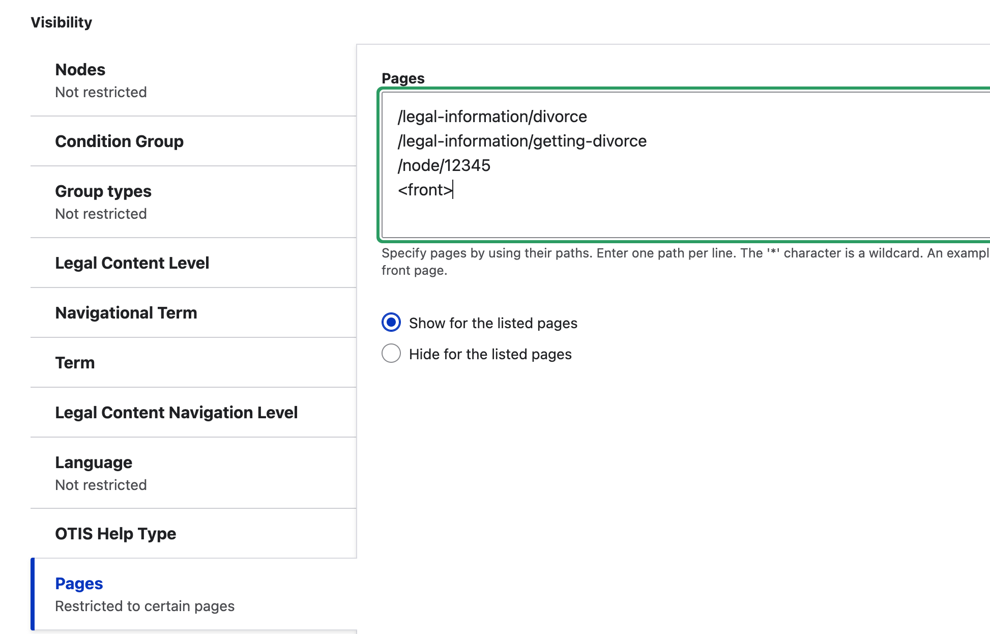
Visibility
All heading blocks should be restricted to specific pages. In the example below, the block is tagged to show on the Divorce easy form, the Getting a divorce guide, a node with node ID 12345 and the home page.
Region & Class
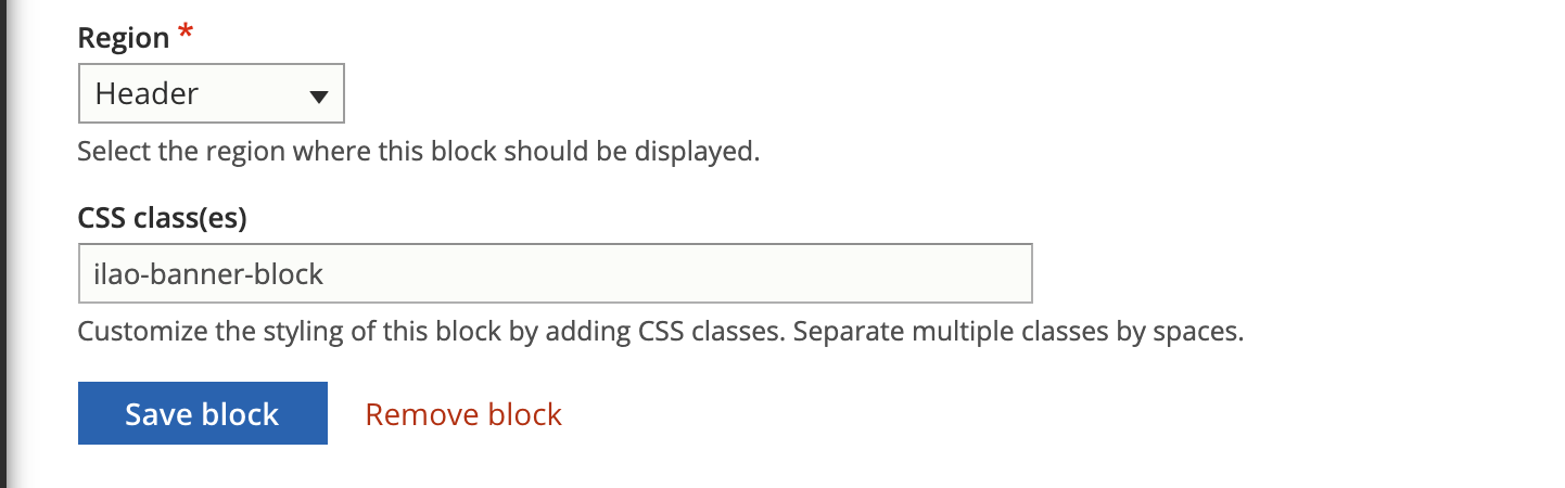
Add the block to the Header section on the block layout page by clicking Place block.
The block must be ordered just above the disabled blocks to keep the block from interfering with menus, site slogan blocks.
Set the block CSS class to ilao-banner-block to cause it to display correctly full-width.
Styles
For the styles, you will need to use the Source view in the WYSIWYG to paste the code in first.
Grey background with wide margins
This is typically used for donation and fundraising.
This is the code used in the header banner to provide the correct style.
<div style="background-color:#F8FAFA;width:100%; padding:20px;font-weight:bold;box-shadow: 0 0.125rem 0.5rem rgba(106,107,113,0.2);">
<p style="padding-bottom:0;font-weight:bold;">
Text goes here
</p>
</div>
It is possible to embed an image in the header such as:
<div style="background-color:#F8FAFA;width:100%; padding:20px;font-weight:bold;box-shadow: 0 0.125rem 0.5rem rgba(106,107,113,0.2);min-height:135px">
<img src="[img source]" style="vertical-align:middle;float:left" width="125px" />Text here</div>
Note
We added a minimum height to the div that is just slightly larger than the height of the image.
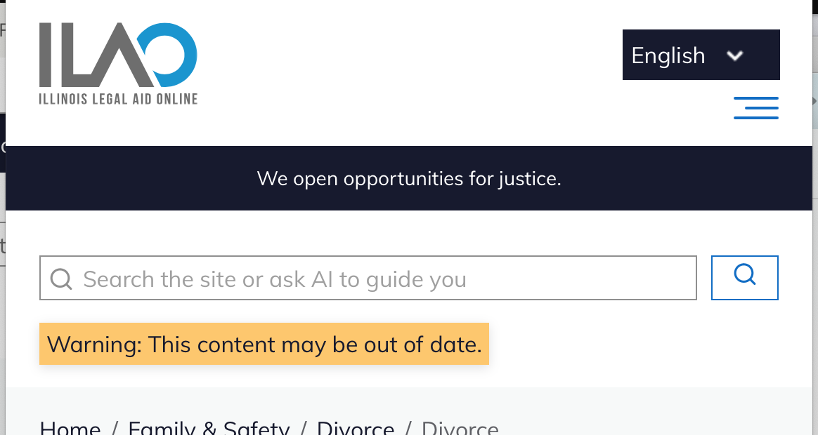
Warning style
This code has a yellow background with minimal padding, resulting in a narrower block.
<div style="background-color:#FFCD6E;box-shadow:0 0.125rem 0.5rem rgba(106,107,113,0.2);padding:5px;width:100%;">
 <p style="padding-bottom:0;">
 Your text goes here
 </p>
 </div>
Danger style
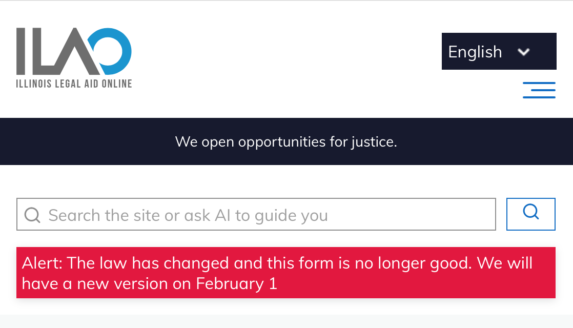
This code has a red background with minimal padding, resulting in a narrower block. The paragraph text is set to white to improve contrast.
<div style="background-color:#AD0034;box-shadow:0 0.125rem 0.5rem rgba(106,107,113,0.2);padding:5px;width:100%;">
 <p style="color:white;padding-bottom:0;">
     Alert: The law has changed and this form is no longer good. We will have a new version on February 1. <a href="#" style="color:FFFF00#f;text-decoration:underline">Learn more</a>
 </p>
 </div>
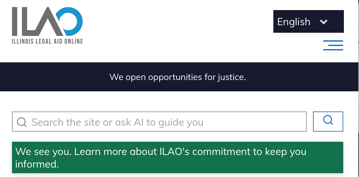
Neutral or positive style
This code has our neutral/positive dark green background with minimal padding, resulting in a narrower block. The paragraph text is set to white to improve contrast.
<div style="background-color:#007D56;box-shadow:0 0.125rem 0.5rem rgba(106,107,113,0.2);padding:5px;width:100%;">
<p style="color:white;padding-bottom:0;">
    We see you. Learn more about <a href="#" style="color:#FFD700;text-decoration:underline">ILAO's commitment to keep you informed</a>.
</p>
</div>
Note
We are working at adding support for Font Awesome icons like the warning symbol in these banners.